Back

UX/UI Redesign for myDigitalPA & PilotAudit applications

Client

Singapore's PSA

Role

UX/UI Designer

Timeline

1 week

Back

UX/UI Redesign for myDigitalPA & PilotAudit applications

Client

Singapore's PSA

Role

UX/UI Designer

Timeline

1 week

December 2023

Heuristic Evaluation, UI Proposal, Web Design

Heuristic Evaluation, UI Proposal, Web Design

8 min reading

8 min reading

July 2024

July 2024

Context

Goals

My Strategy

Heuristic Evaluation

UI Redesign

Learnings

Context

Goals

My Strategy

Heuristic Evaluation

UI Redesign

Learnings

Context

PSA Singapore is a leading port group and trusted partner to cargo stakeholders worldwide. They have developed two key applications: myDigitalPA and PilotAudit, designed specifically for their pilot teams and managers.

However, the current applications are outdated, with an interface that feels antiquated.With the redesign, PSAM aims to:

Enhance the UI/UX design to achieve a contemporary, sleek, and refreshing appearance

Enhance the UI/UX design to achieve a contemporary, sleek, and refreshing appearance

Enhance the UI/UX design to achieve a contemporary, sleek, and refreshing appearance

Enhance the UI/UX design to achieve a contemporary, sleek, and refreshing appearance

Improving overall user experience in terms of functionality and ease of use

Improving overall user experience in terms of functionality and ease of use

Improving overall user experience in terms of functionality and ease of use

Improving overall user experience in terms of functionality and ease of use

Goals

Build a design direction and guideline

  • Build a demo the interface for myDigitalPA and Pilot Audit.

  • Improve access to essential information and streamline essential tasks.

The final deliverable from UI/UX for this project will be a new UI design for myDigitalPA and Pilot Audit on Figma file.

My Strategy

🌟 Conduct a Heuristic Evaluation to identify design problems in your user interface.

🌟 Problem Statement

🌟 UI Redesign

Heuristic Evaluation

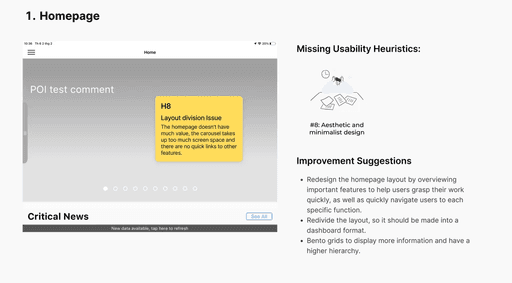
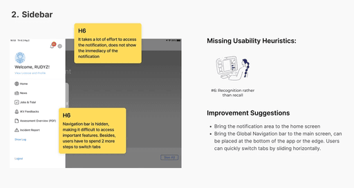
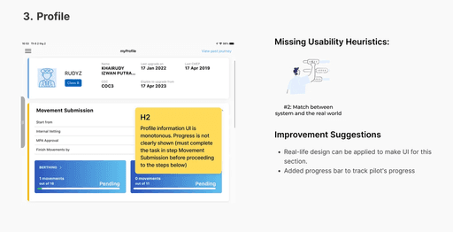
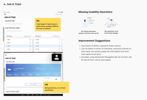
I conducted a Heuristic Evaluation with 3 UX/UI Designers from the team. We independently reviewed the main screens of the application to identify UI issues and areas for improvement.

✏️ Problem Statement

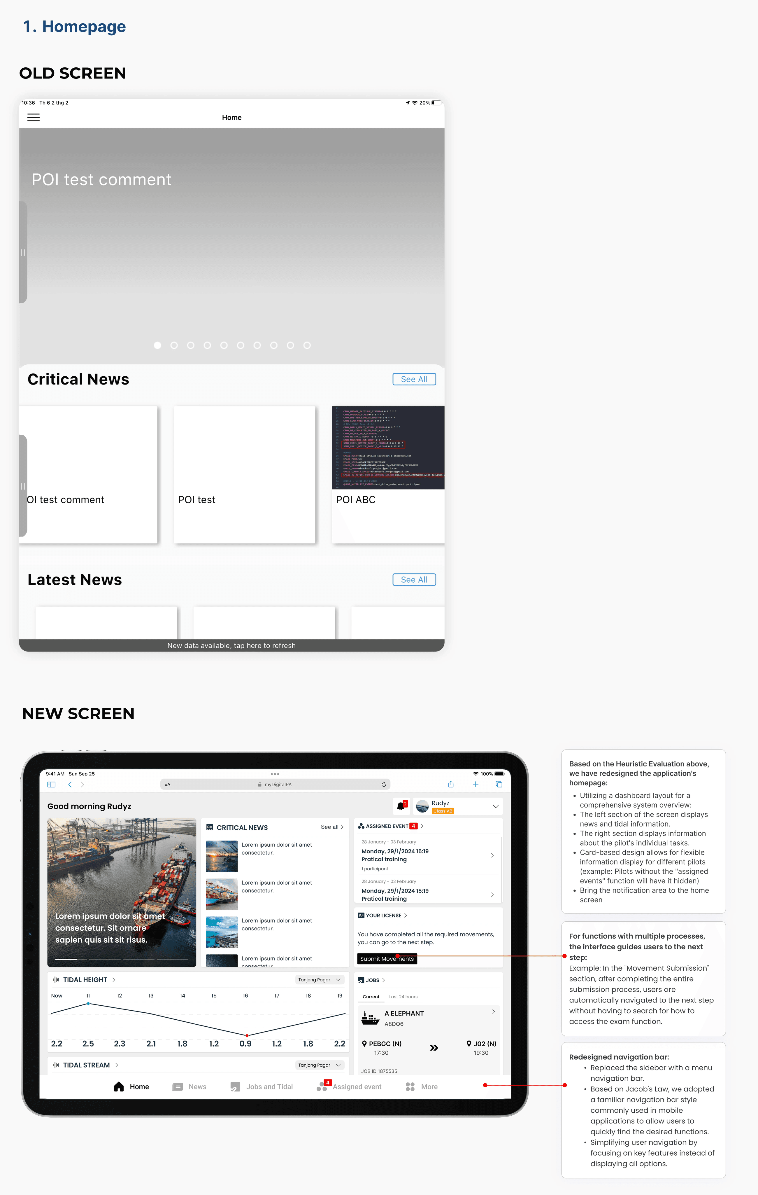
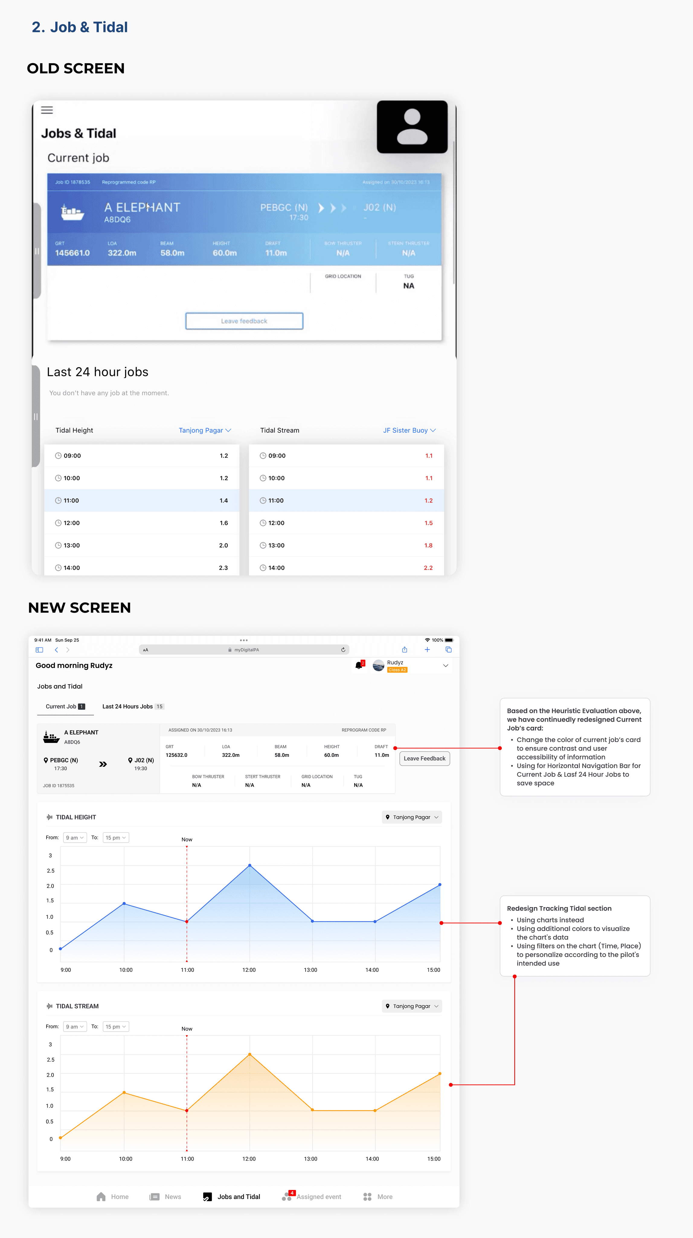
Current apps often suffer from cluttered interfaces, outdated information, and difficulty navigating key features. This redesign focuses on enhancing user experience by addressing these issues:

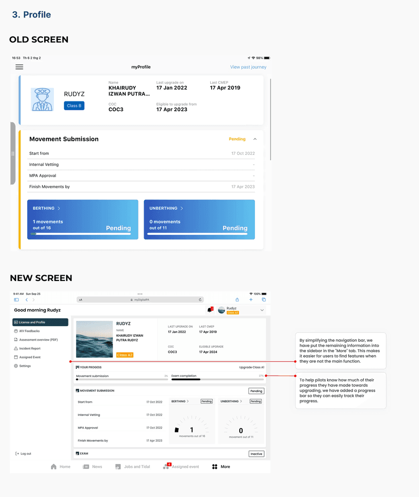
  • Information overload: Excessive data makes it hard to find jobs, tide, and licensing details.

  • Navigation complexity: Unintuitive menus and hidden features hinder efficient access to necessary functionalities.

  • Lack of visualization: Data on current job, last 24 hour jobs and tidal lack clear visual representation for quick interpretation.

OK! Time to redesignπŸ‘¨πŸΌβ€πŸ³

πŸ”₯Deep into UI design

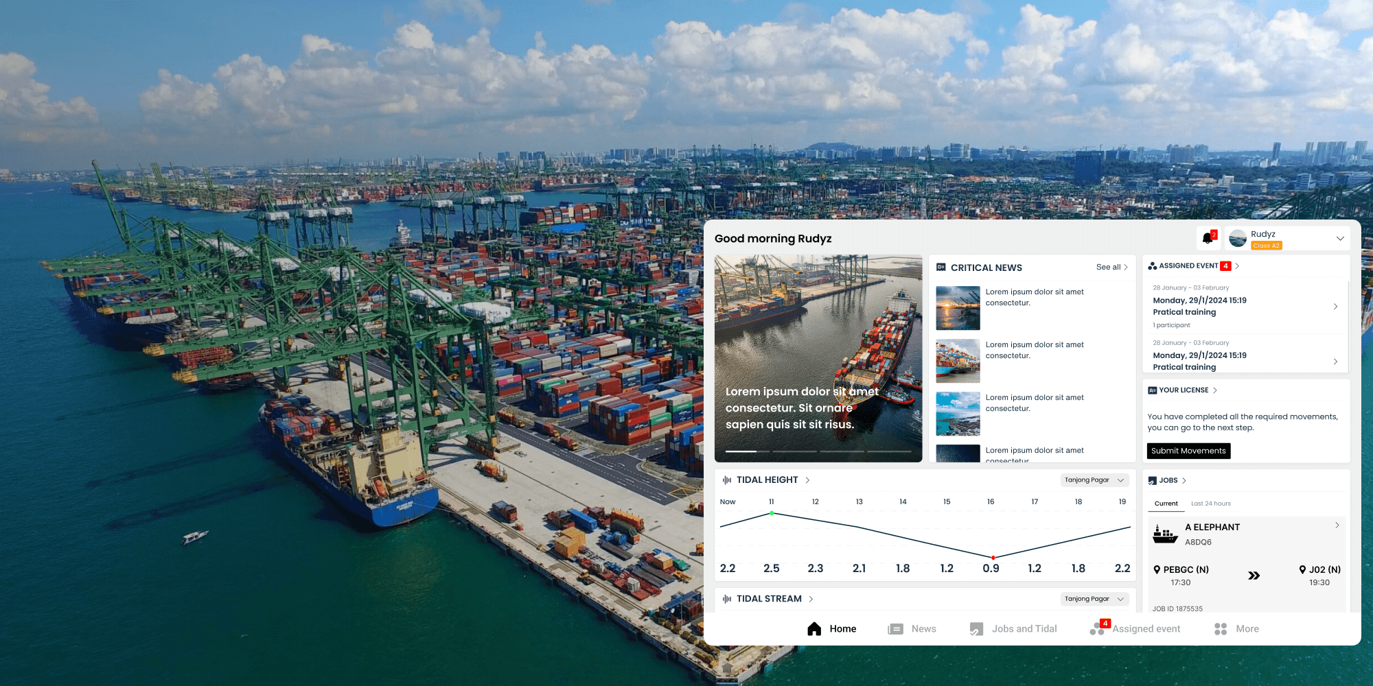
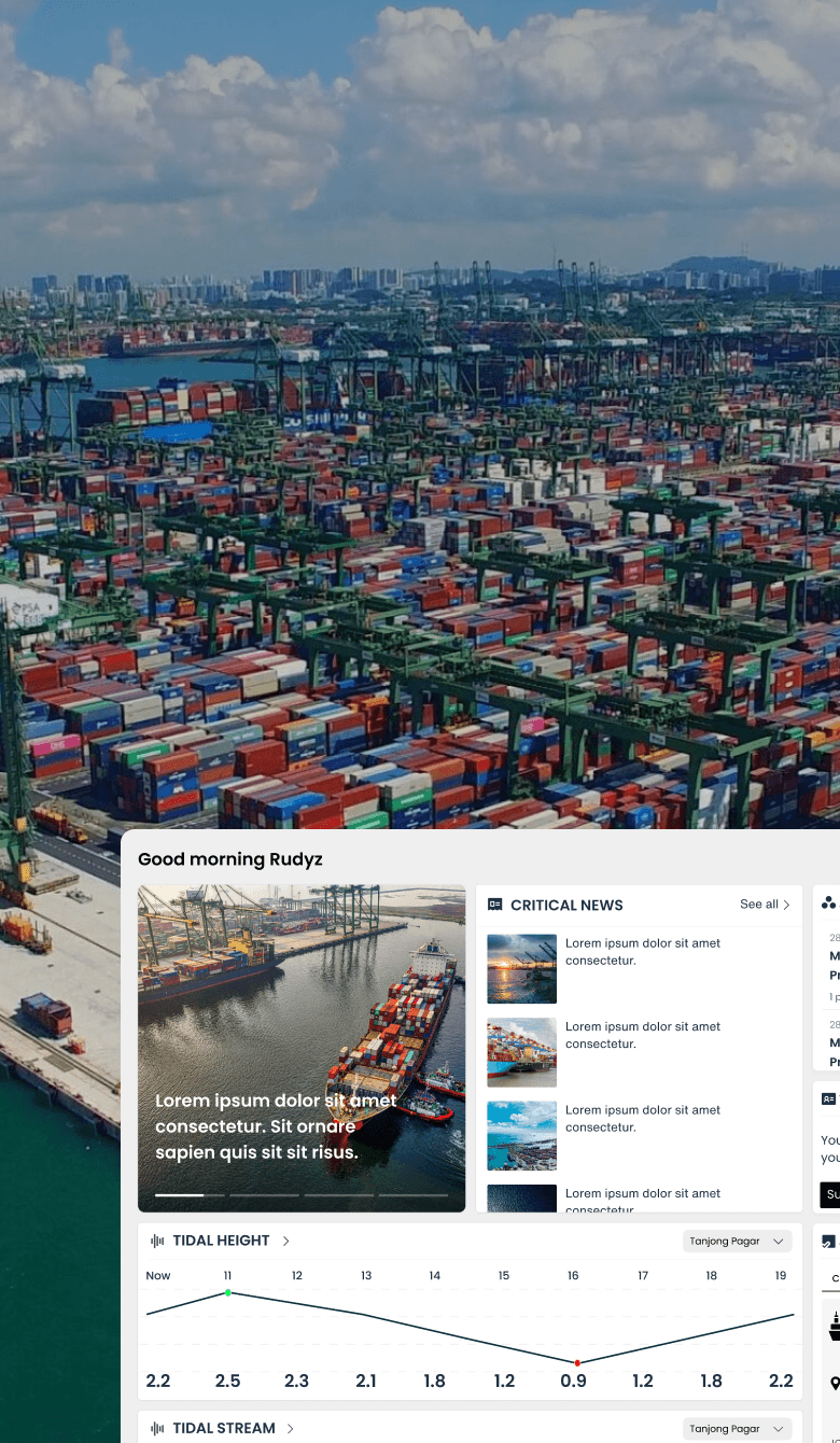
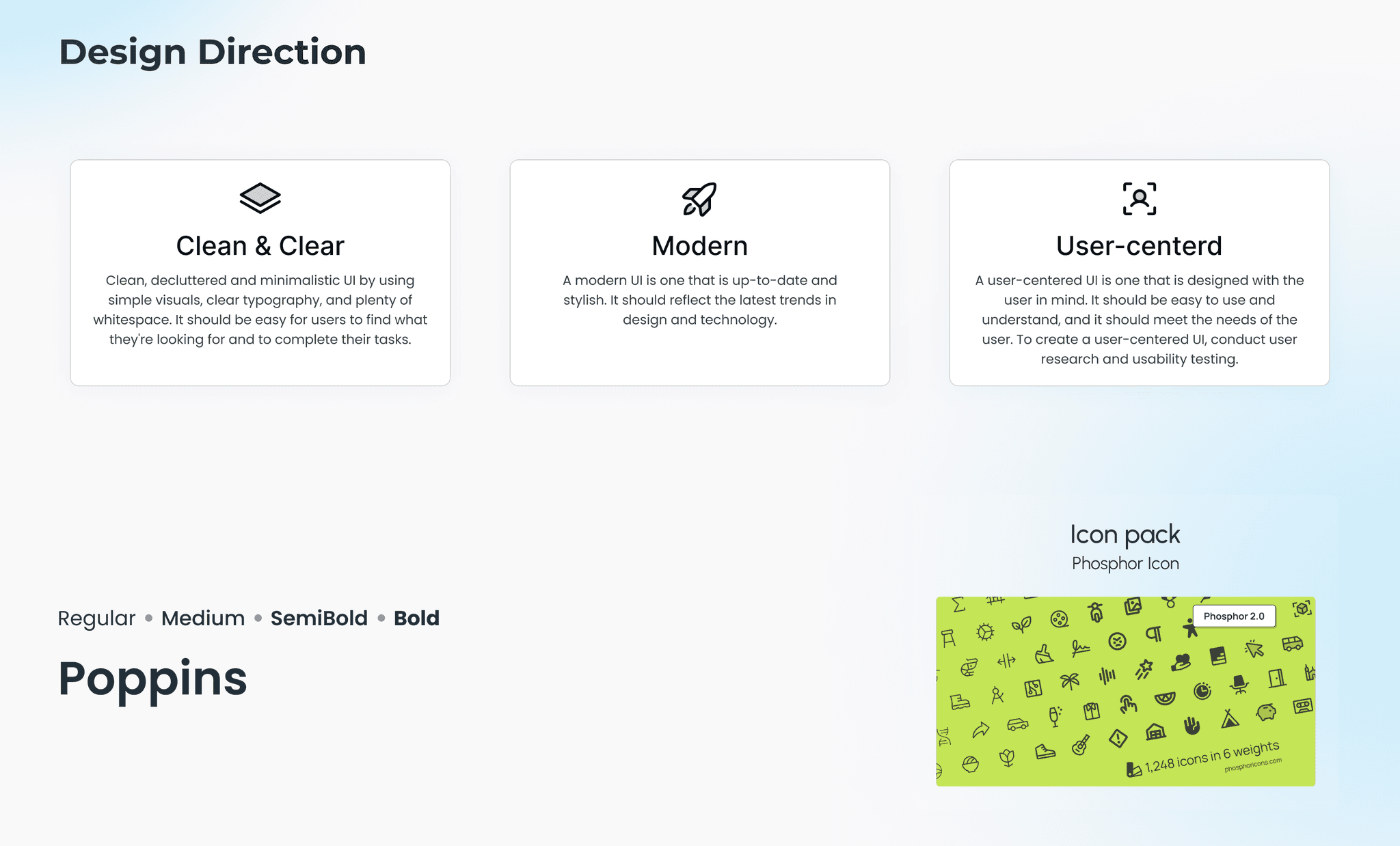
After analyzing the functions that need improvement, we have prepared 3 options for the interface design style for myDigitalPA and Pilot Audit

πŸ›«

Option 1

Inspired by Google's Material 3, this is a design style with bright colors and rounded corners. This design creates a pleasant, user-friendly and modern feel.

πŸ›«

Option 1

Inspired by Google's Material 3, this is a design style with bright colors and rounded corners. This design creates a pleasant, user-friendly and modern feel.

πŸ›«

Option 1

Inspired by Google's Material 3, this is a design style with bright colors and rounded corners. This design creates a pleasant, user-friendly and modern feel.

πŸ›«

Option 1

Inspired by Google's Material 3, this is a design style with bright colors and rounded corners. This design creates a pleasant, user-friendly and modern feel.

πŸ›«

Option 2

Glassmorphism is a hot UI design trend that uses a frosted glass effect to add depth and dimension to interfaces. Think of looking through slightly cloudy glass – elements are layered and backgrounds show through in a blurred way. It creates a modern, sleek feel.

πŸ›«

Option 2

Glassmorphism is a hot UI design trend that uses a frosted glass effect to add depth and dimension to interfaces. Think of looking through slightly cloudy glass – elements are layered and backgrounds show through in a blurred way. It creates a modern, sleek feel.

πŸ›«

Option 2

Glassmorphism is a hot UI design trend that uses a frosted glass effect to add depth and dimension to interfaces. Think of looking through slightly cloudy glass – elements are layered and backgrounds show through in a blurred way. It creates a modern, sleek feel.

πŸ›«

Option 2

Glassmorphism is a hot UI design trend that uses a frosted glass effect to add depth and dimension to interfaces. Think of looking through slightly cloudy glass – elements are layered and backgrounds show through in a blurred way. It creates a modern, sleek feel.

πŸ›«

Option 3

In UI design, monochrome palettes (using one color's shades) and minimalism (focusing on essentials) often work together. Both aim for clean, uncluttered interfaces. Monochrome supports minimalism by reducing color distractions, while minimalism naturally leans towards monochromes due to its "essentials only" approach

Learnings

How to apply the 10 Usability Heuristics analysis method to improve UI design.

  • Experience designing in many different styles, helping to update the latest design trends today.

  • How to build a proposal for UX/UI design.