Context
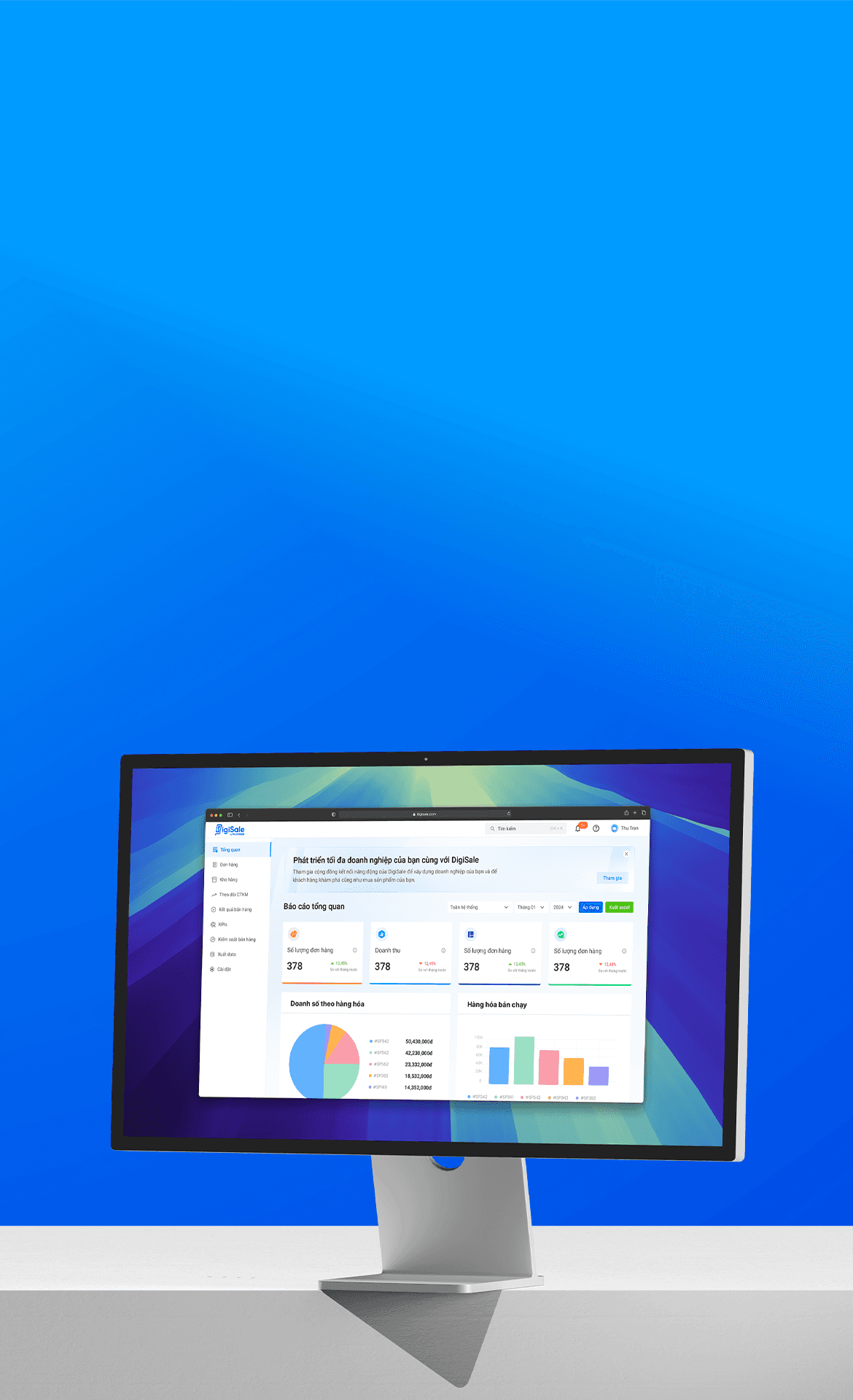
The DigiSale DMS project was launched to streamline complex distribution management for businesses, aiming to unify diverse processes into a user-friendly platform. With 8 key features
I joined from the project’s inception, contributing to foundational elements like branding and design strategy. My goal was to create a cohesive design system that enhanced usability, simplified interactions, and provided a seamless experience across all modules.
Goals
My Strategy
🌟 Conduct Research: Performed desk research, competitor analysis, and field research to gather initial insights.
🌟 Review and Analyze: Revisited research findings to extract valuable insights for design direction.
🌟 Design Brand Guidelines: Created comprehensive design guidelines to establish a cohesive brand identity.
🌟 Develop a Design System: Built a scalable design system as the foundation for consistent and efficient design.
🌟 Feature Design: Designed each feature using the design system in iterative sprints, ensuring team alignment and consistency.
🌟 Feedback and Iteration: Collected feedback at the end of each sprint, analyzed issues, and refined processes as needed.
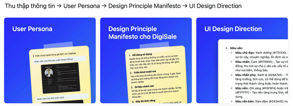
What I gather after research
Challenges
At the beginning of the project, the team faced significant challenges in analyzing and researching an entirely new domain, including:
• Understanding the complexity of the real-world supply chain to develop solutions that optimize business processes.
• Meeting the needs and access levels of diverse user groups: The DMS is used by various stakeholders, including senior managers, warehouse staff, salespeople, and distributors.
• Creating an interface and user experience that is seamless yet maintains simplicity and consistency throughout.
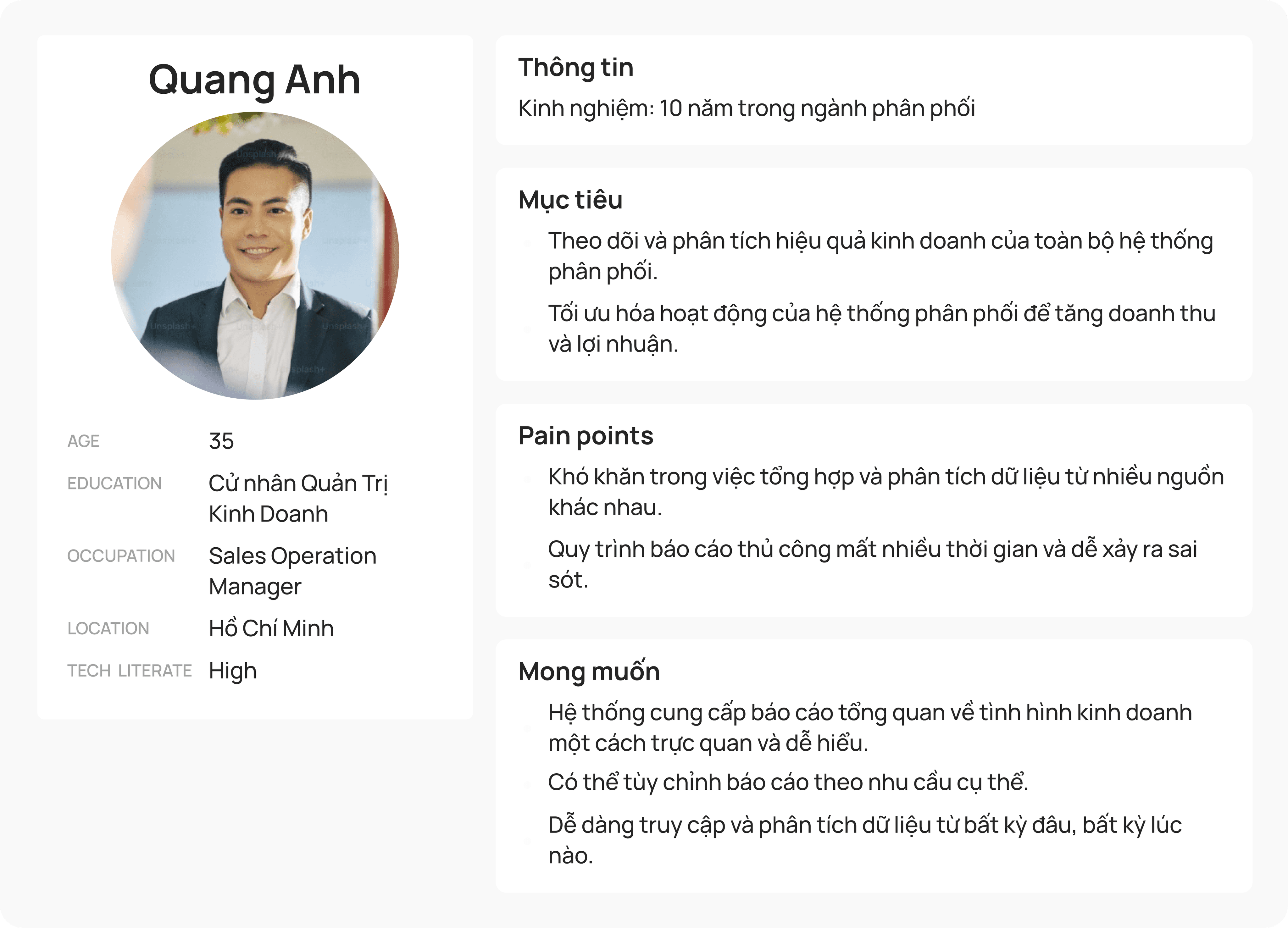
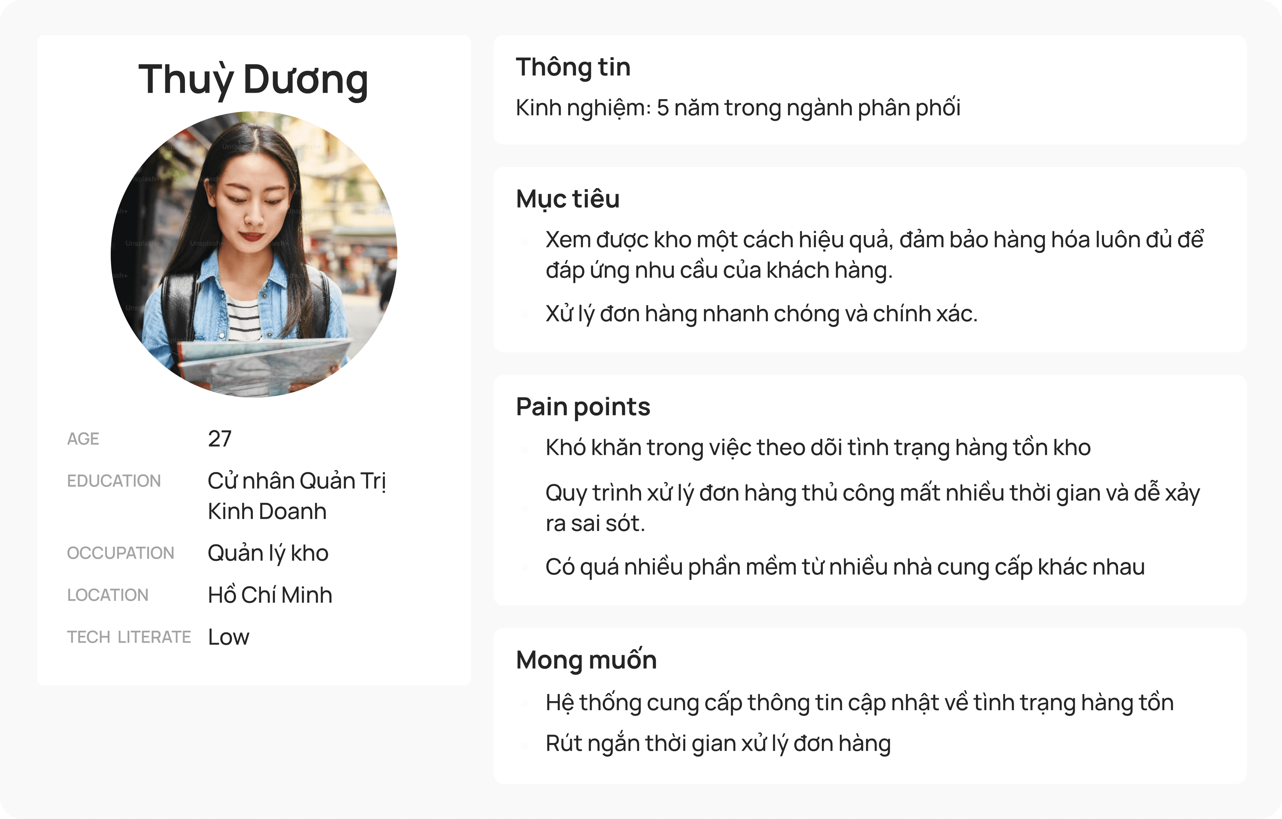
User Persona
We had the opportunity to conduct on-site visits and in-depth interviews with operational staff at Lothamilk’s head office and distributors within their product supply chain.
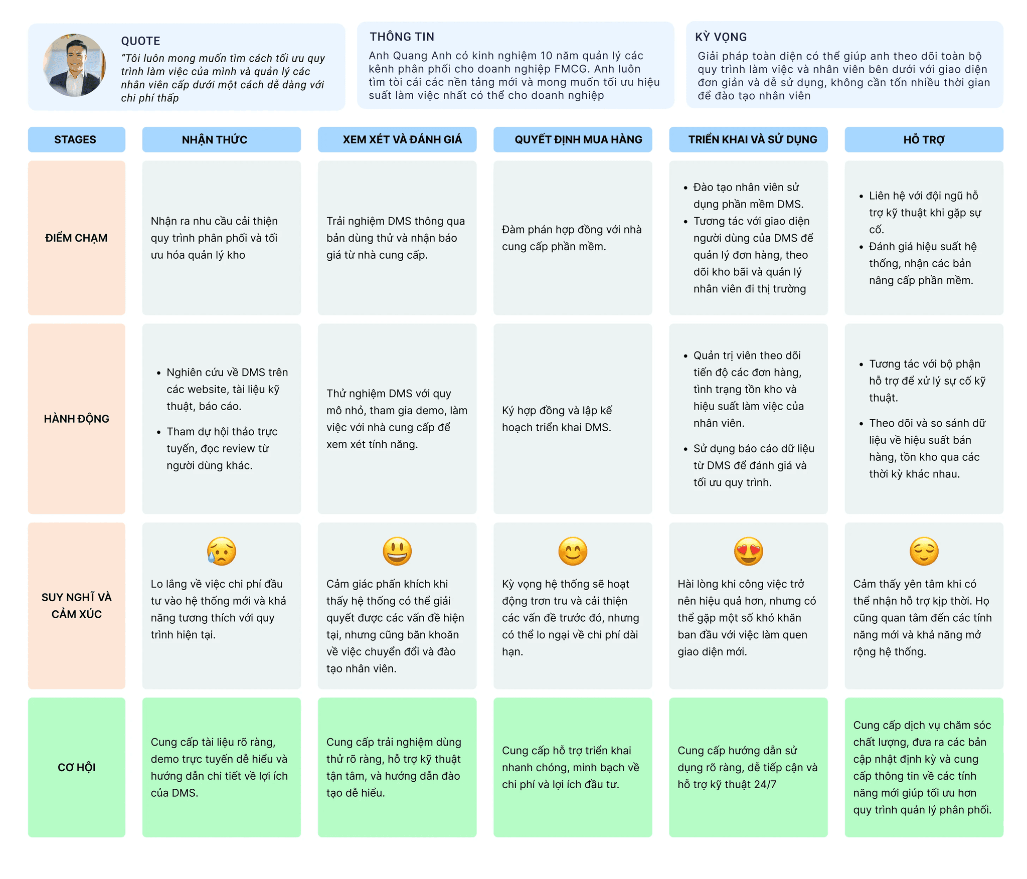
Customer Journey Map
✏️ Design Statement
Brand Design
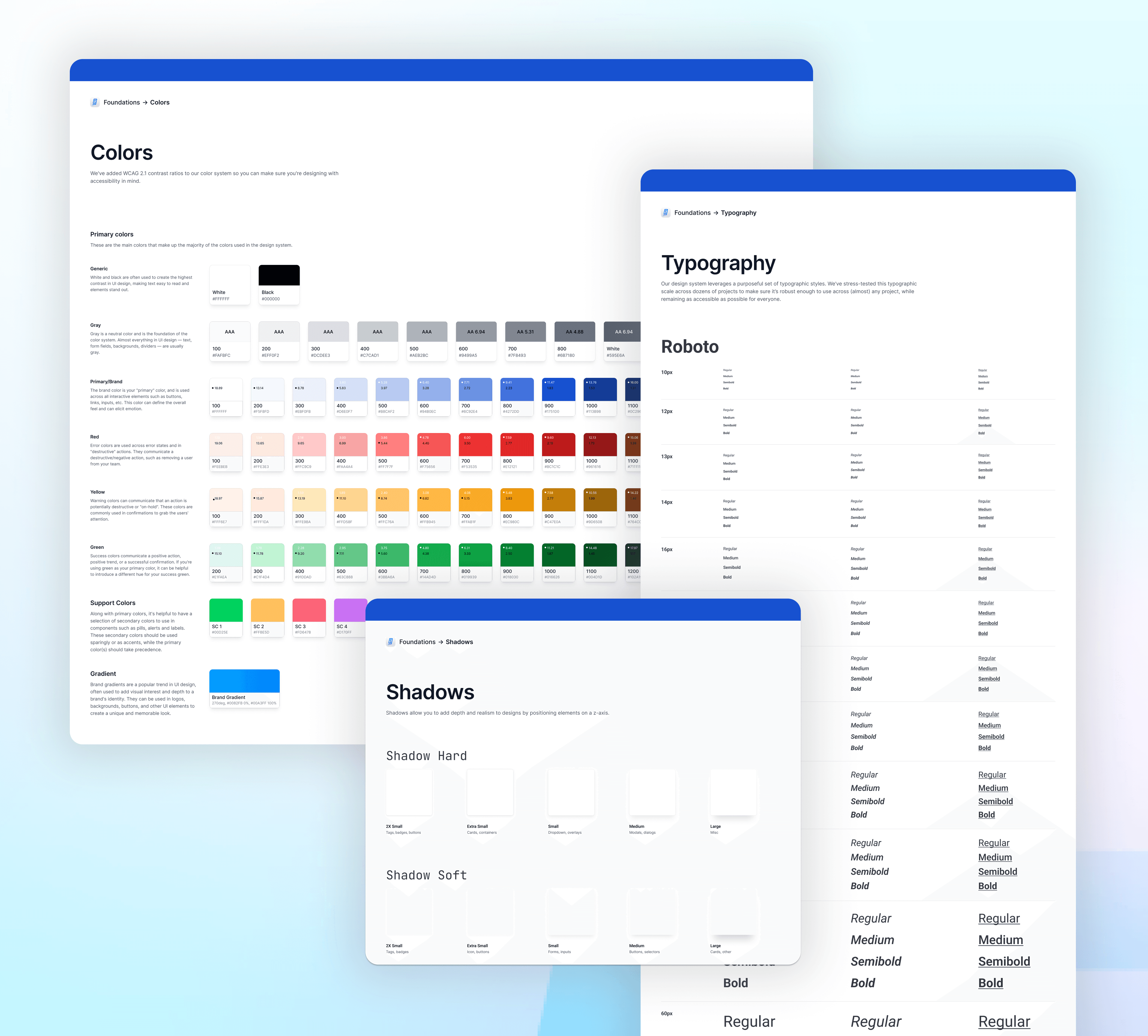
Global Design System
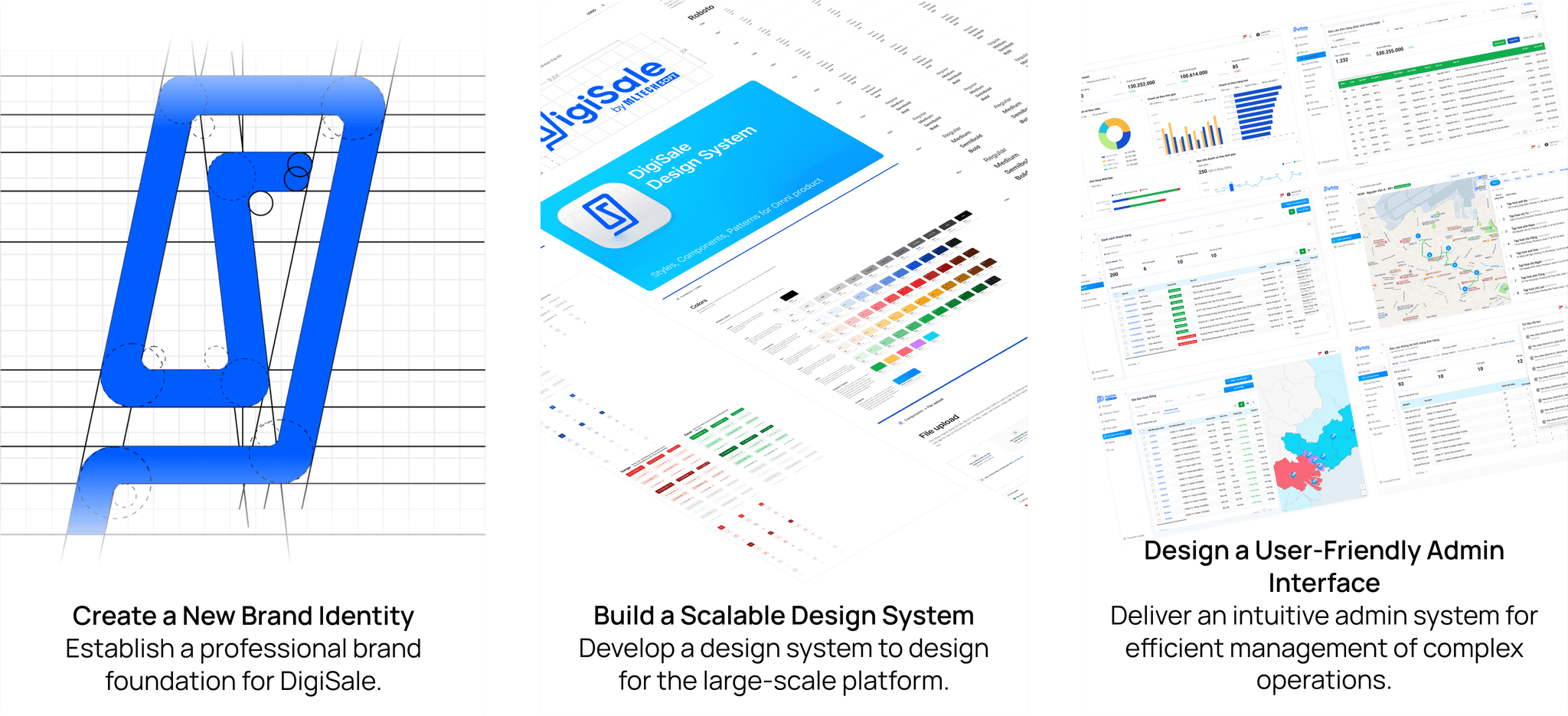
After defining the brand identity and Design Principle Manifesto, we developed a comprehensive Design System. This guide ensures consistent visuals and user experience across all system features, streamlining the design and development process.
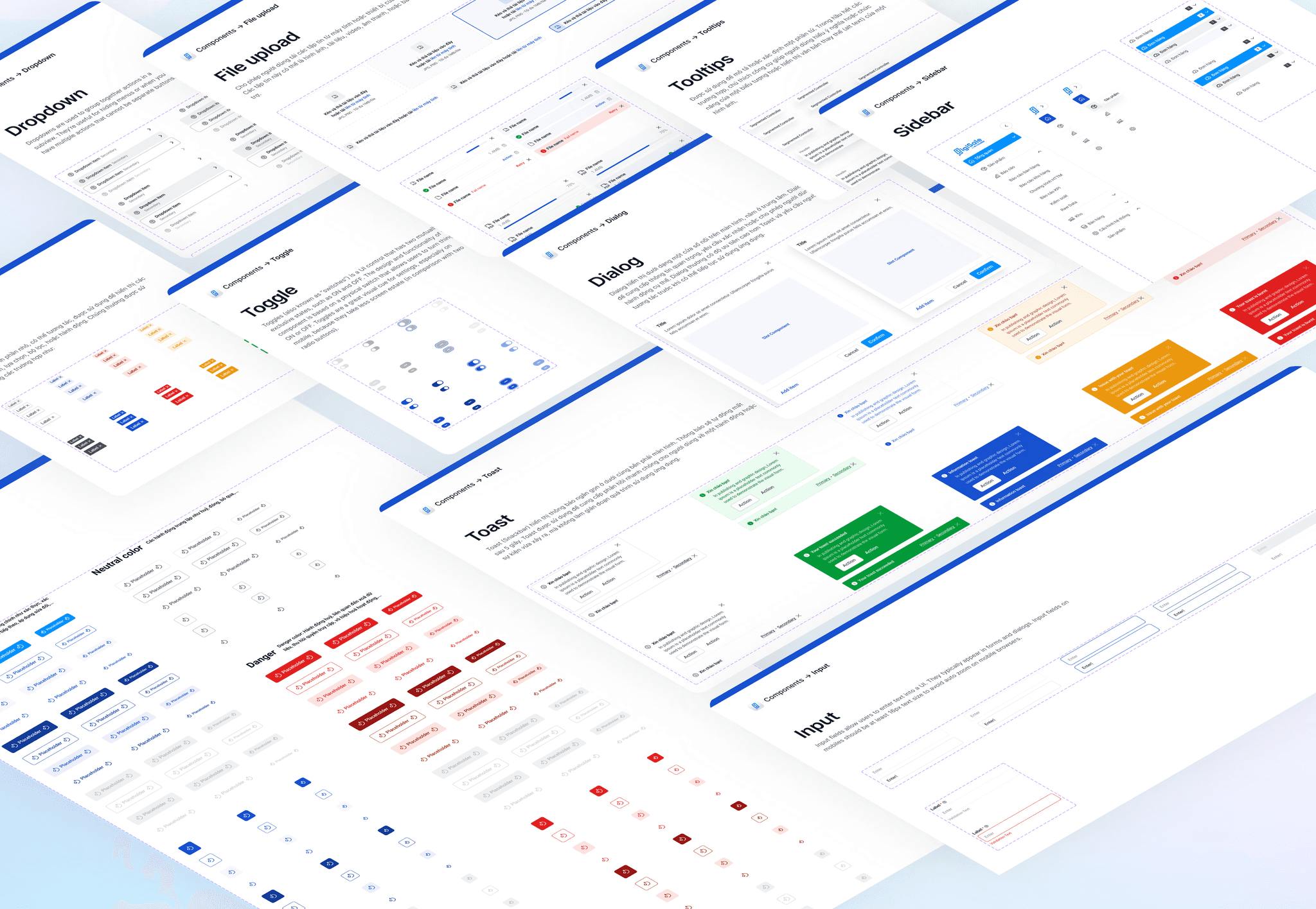
We built this from the smallest component up
UI Showcase
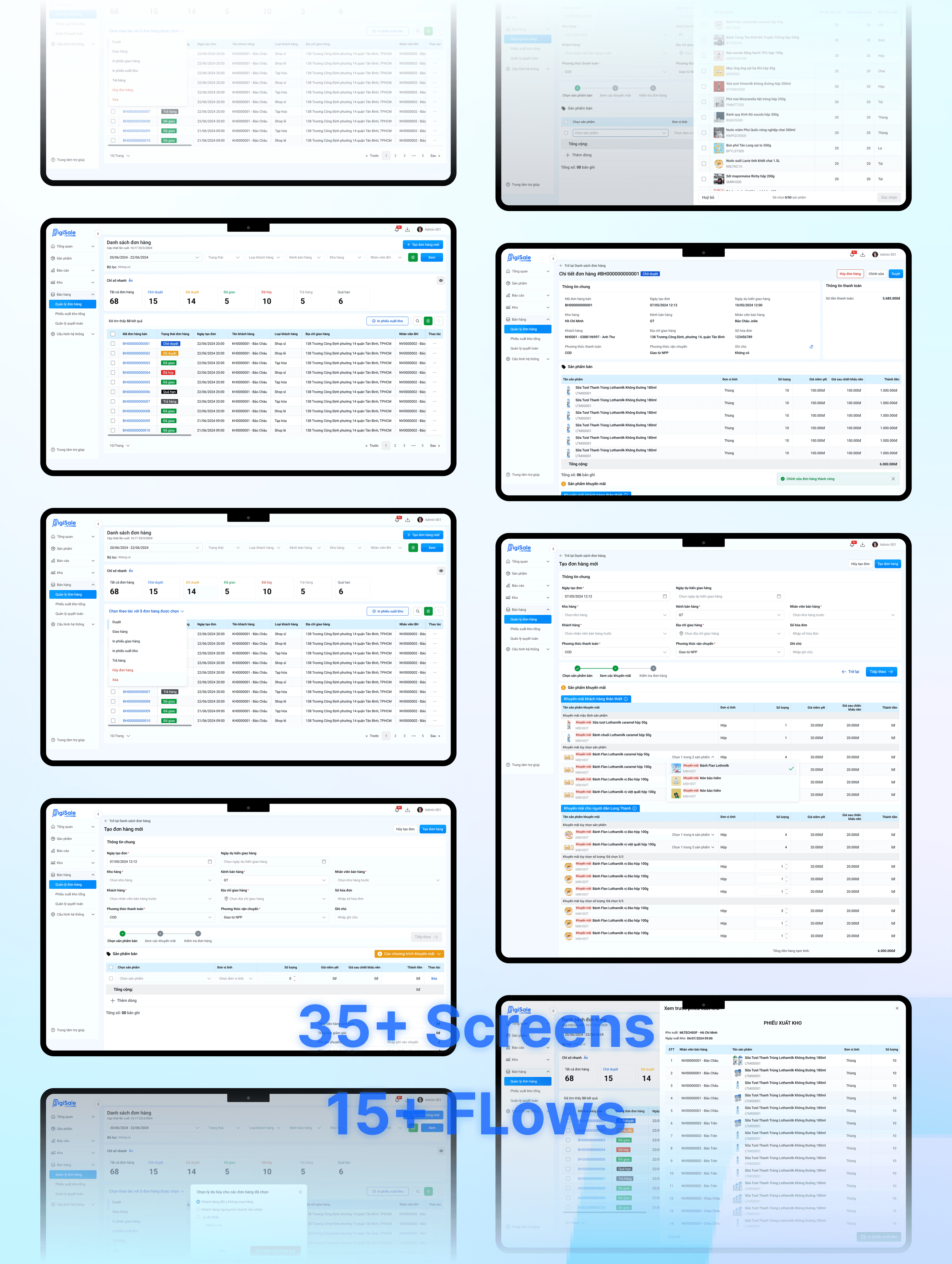
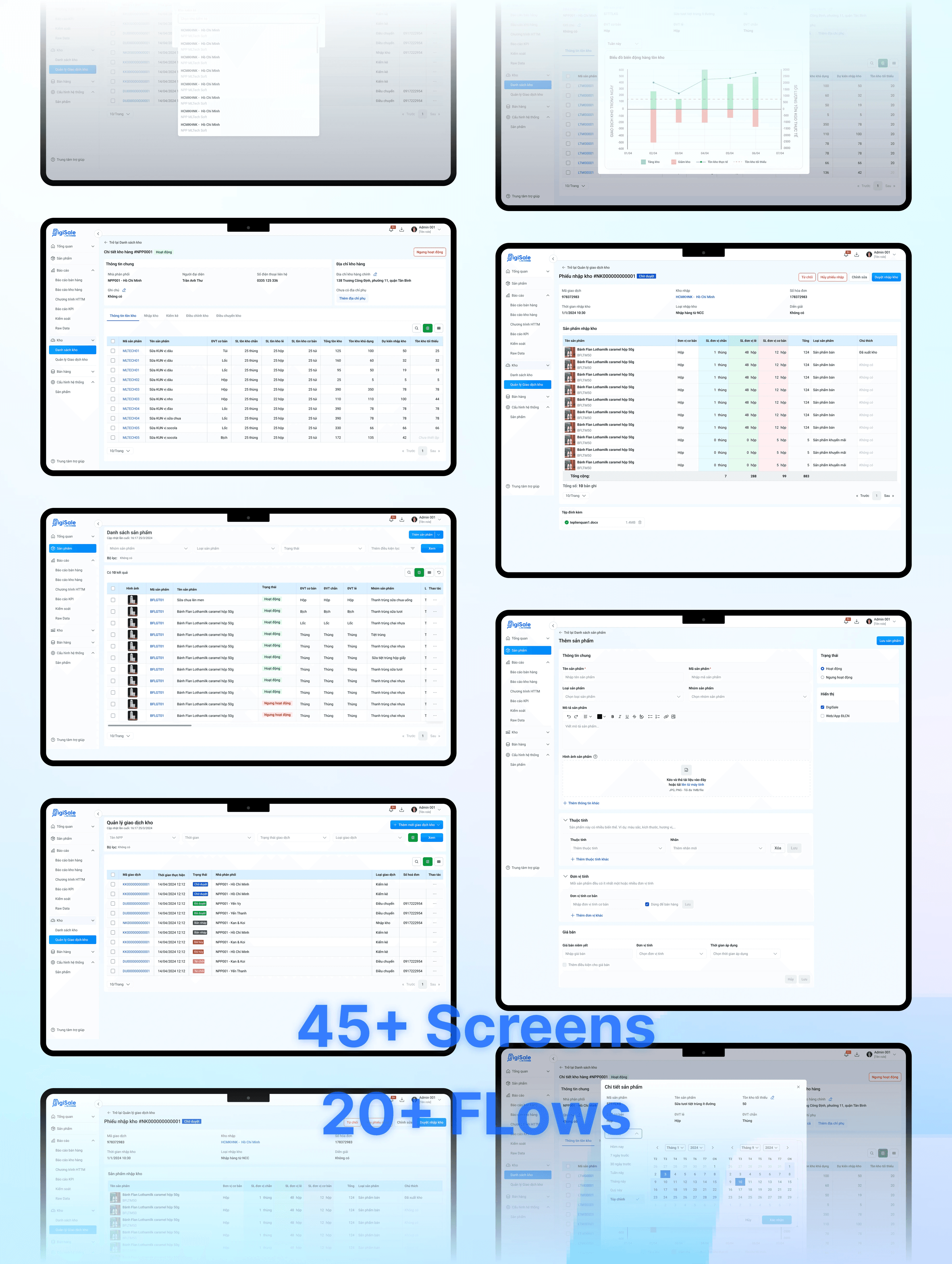
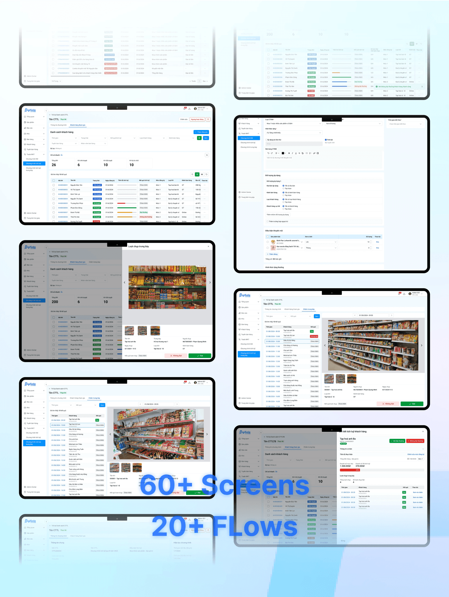
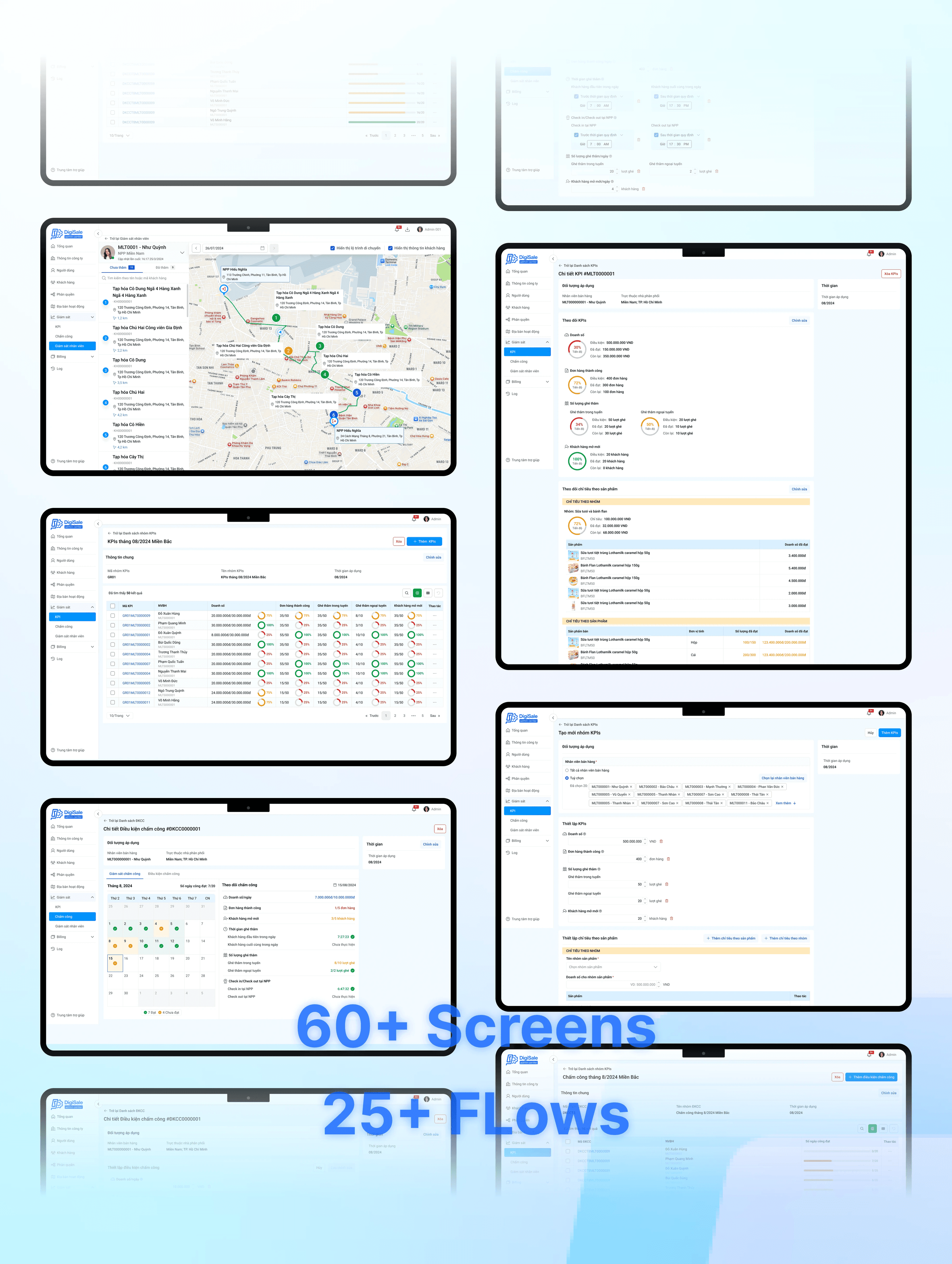
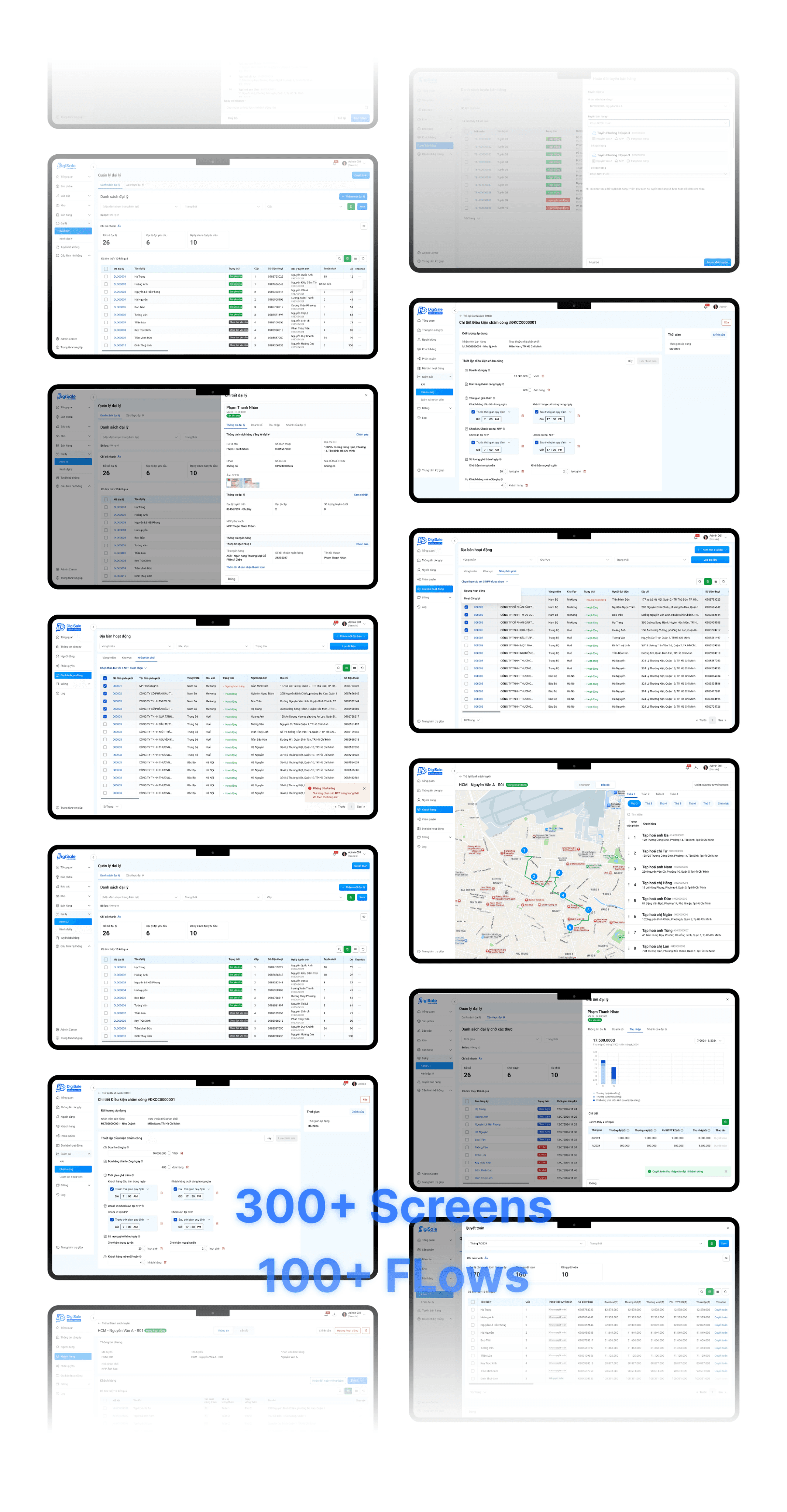
We have successfully designed the entire DigiSale MVP version 1, featuring 8 major functional groups, over 500 screens, and more than 200 flows to cover various use cases.
Learnings
This was my first time leading a project with such a large volume of screens. Being the team leader was a success, as I guided the team from the smallest tasks to the completion of the final product.

